
One of my first blog posts for the old Sardis Verlag homepage was a “Making of” for the Imperium Romanum map. It even existed as a promotional poster back then. Since I am asked this question from time to time, I thought it might be good to write something like this again.
All my maps are nearly entirely done with QGIS, an open source Geo Information System. However, for data collection I mostly use Google Earth Pro.
The first, and most lengthy step, is collecting the required data for an period accurate map. Studying the required literature to fill out a big wall map can take years. But once a site that should be included is identified it still necessary to find the correct spot. While some, usually more recent publications, already include geo coordinates, in most cases I have to gather them by myself with the help of maps or images of the site. Here Google Earth Pro comes into play. The satellite and aerial images available for multiple years there are of immense value for this. Additionally, they can also help with identifying old river courses, lakes or coastlines, finding the most likely path for an old road between two known points or simply the the coordinates for some point on the ground.
Sites or linear features marked in Google Earth Pro can be exported as .kml files, which can be directly imported into QGIS.

The sites of Hebua I and II, ancient Egyptian Tjaru, and the remnants of an old channel between them in Google Earth.
The next step, after or mostly during data collection, is making the actual map. First a suitable projection has to be chosen for the project. Thereafter by first creating an optically attractive background from modern geo data and modifying this data to represent the ancient state as accurately as possible.
The background of my maps is not a single base layer, but a combination of 3+ layers stacked on top of each other. Most of the data is from Natural Earth originally and was then modified and supplemented for the need of each map over the course of the last eight years.
Lowest level is the shaded relief. This is a raster file calculated in QGIS from SRTM data, the biggest in size and only covers the area of the actual map. I make them individually for each map in the required resolution. Natural Earth also offers several shaded reliefs to download, but for my maps their resolution was too low.

The shaded relief base layer for my Classical Greece map.
On top of the relief sits the Landclass file, set as semi transparent and color adjusted for the map in QGIS. For most maps I use an georeferenced image from Natural Earth with the coloring based on idealized land cover without the extensive human influenced changes of the last millennia.
However, for large scale projects, like my Bronze Age maps, the resolution is too low. For them a high res cloud free satellite image of the entire globe (Blue Marble from NASA) is used. The image is slowly modified by me to remove traces of reservoirs or modern settlements in the areas covered by the respective maps. In key areas, like the Nile Valley, additional semi transparent vector layers on top are used to get more uniform appearance.
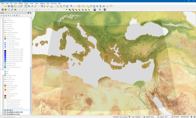


a) Landclass file on top of the shaded relief, b) Bathymetry 0 file, c) Bathymetry, landclass and relief combined into the background for the remaining vector layers.
Next are a group of bathymetry vector files, originally from Natural Earth too. The lowest, layer 0 is solid without any transparency and defines the coast. Depending on each map, I’ve made some extensive modifications to it to depict the ancient coastline, added more islands or improved the shape of key features. Finally, a semi transparent layer on top is used with the shapeburst fill option to get the desired look and highlight the shore. The remaining topographical features, rivers, lakes, settlements, etc. are all vector files on top of these base layers.

Reconstructing the late Bronze Age coastline near the mouth of the modern Suez Canal. The approach to Pi-Ramesse. Unlike in the western delta here it has advanced considerably in the last 3000 years.
Once all is done the labels can placed. On my maps they are also geographically fixed and the curved names of tribes or regions are placed on top of invisible line features. Only things like the legend, scale bar, titles for ancillary maps and so on are created in the QGIS layout manager, the former print composer, and are specific for each layout. It is also here that the format for each export is chosen.
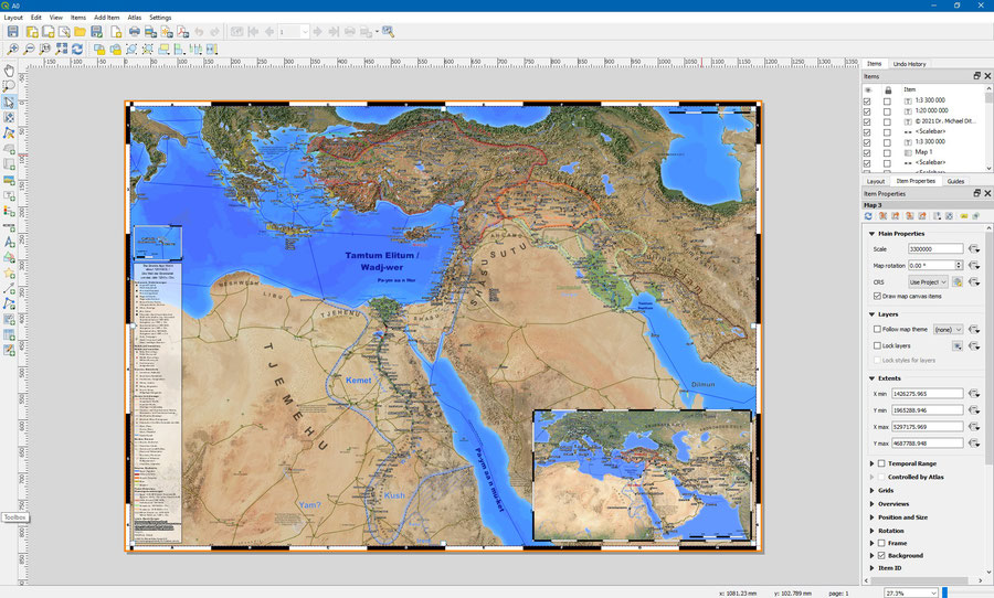
The A0 version of my Bronze Age map in the QGIS layout manager.
Write a comment